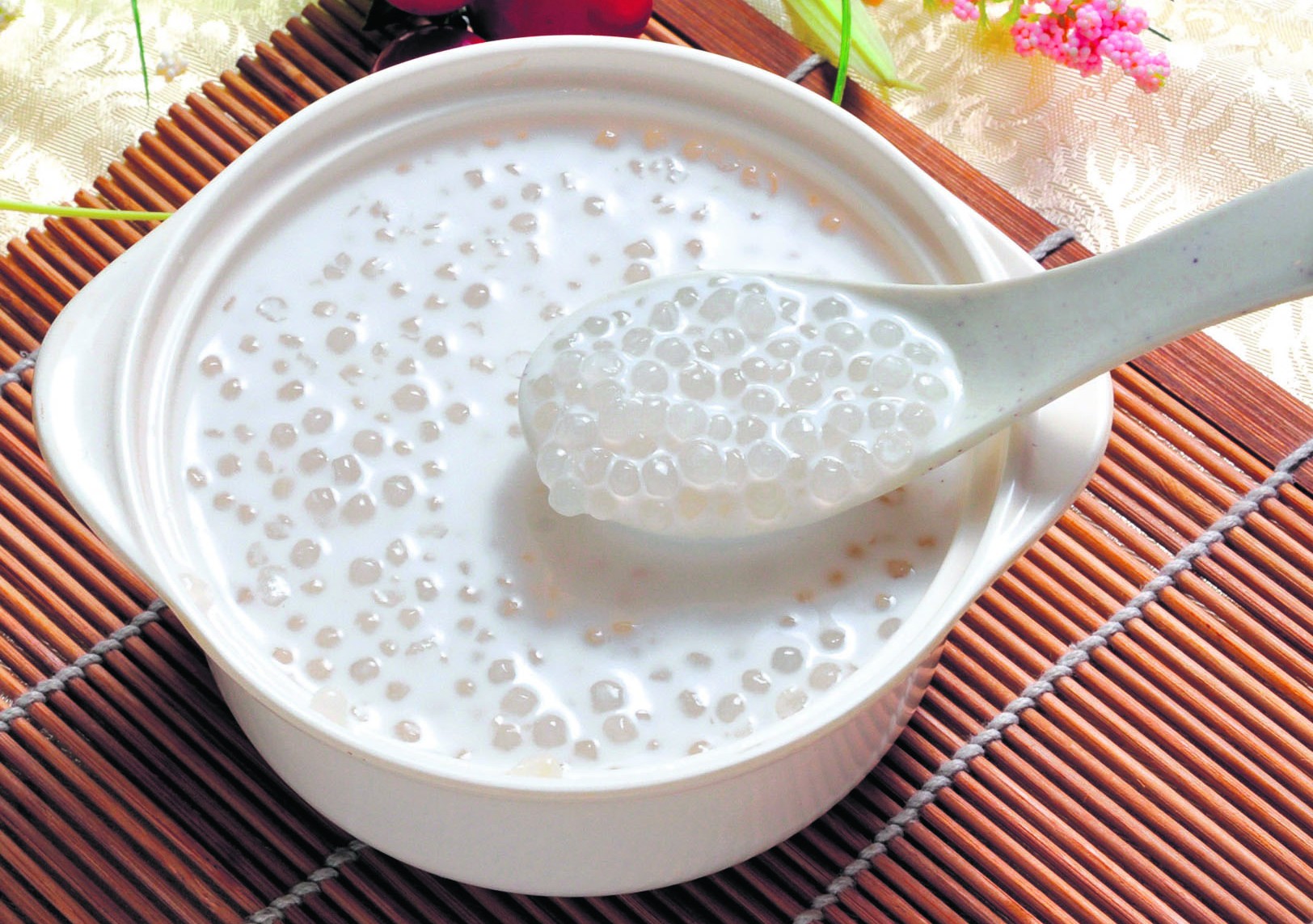
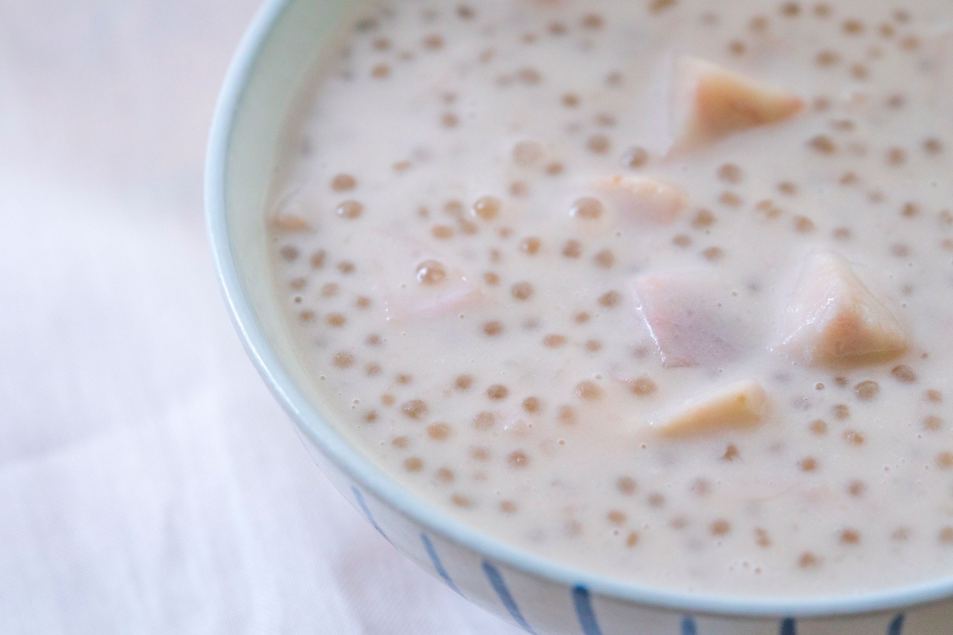
Taro sago coconut dessert or Sai mai lo (西米露) is a classic Cantonese dessert. It's often served in Chinese restaurants after a banquet or dinner, but it's a common dessert that anyone can make.


The website's information is very clear, and I think it's interesting how the ingredients and the directions are laid out side by side. I do wonder how well that would work/look when the instructions are much longer than the ingredients list. There is an option to select/deselect ingredients. While I question the usefulness of this function, I want to look into it and maybe incorporate it into my page.
I like the photo gallery at the top and the border around the recipe details. It also includes nutrition info which is something I will consider. It also has a wide margin and I like how it contains the information neatly.
At the top of each recipe page is a large hero image with the title, a star rating, and option to save the recipe. It's a visually compelling way to introduce the food. Overall, the design of the page is clear and pleasant to look at.
I like the colors and how the visual language matches with the natural branding. The "buy" section's buttons and style are things that I want to incorporate within my page design.
There are a few simple main colors and what makes this website stand out to me is the illustration that is repeated throughout the site. I was thinking that I could put a character in my site that "guides" the user through the recipe.
The "Double Chocolate Cookie Dough" section shows ingredients in a simplistic yet visually appealing way and I want to show my ingredients like that as well. The color palette in this website inspires me to use soft colors in my project.